


Have you ever mapped your clients? If you haven’t, you are not alone, but it is a great time to get on board. While it can sound like something that requires extensive resources or specialized expertise, it is becoming more accessible than ever.
Interestingly, when I talk with practices about mapping their clients, most have never done it. This may be because it simply has not crossed their minds, resources or time feel limited, or it is unclear what they would actually gain from the exercise. Yet the practices that do map their clients almost always say it was eye-opening and wish they had done it sooner.
Once you see your practice geographically, it changes how you think about growth, access, marketing, and even pricing.
Mapping client addresses is one of the simplest ways to understand how far clients are traveling, where your strongest client clusters are, geographic barriers (rivers, highways, traffic patterns), and areas where you assumed demand but don’t really see clients. I’ve mapped practices where two clinics were separated by a river, and clients almost never crossed it. That wasn’t obvious from revenue reports alone, but visually it was immediate. How cool is that? That kind of insight could help answer whether a practice is truly local, regional, or destination care, or if they are losing potential clients because of geography, accessibility, or nearby competition.
Sometimes the map challenges your assumptions in the best way. I once mapped a practice’s clients because they wanted to evaluate whether a marketing campaign was attracting new clients. Another practice owner wanted to better understand the key areas their practice served, and if there was any overlap.
This is the power of mapping your clients, and not just with visualization, but also aligning locations with visit frequency, veterinary expenditures, service mix, and tenure at the practice. This can help uncover opportunities for your practice. Suddenly you’re not just looking at dots on a map, but you’re seeing patterns: higher-spending neighborhoods, areas with lower visit frequency, regions where clients travel farther but spend more, and areas that may be more price-sensitive. This connects directly to demographics and willingness-to-pay discussions (which I’ve talked about in previous blogs). Geography often explains behavior in ways spreadsheets alone can’t.
Let’s take a look at an example. Below is a fictional client dataset, plotted on a map as black dots. A 3- and 5-mile radius buffer is placed around this practice. This buffer could also reflect drive times or another distance measure specific to your practice. Rural practices may want to look further out to capture their market area more effectively. For simplicity’s sake, we stick with the 3- and 5-mile radii (the orange and blue rings, respectively). The yellow-orange triangle is a competitor – watch out!
Map 1: Fictional client distribution map with 3- and 5-mile trade area buffers and nearby competitor location.
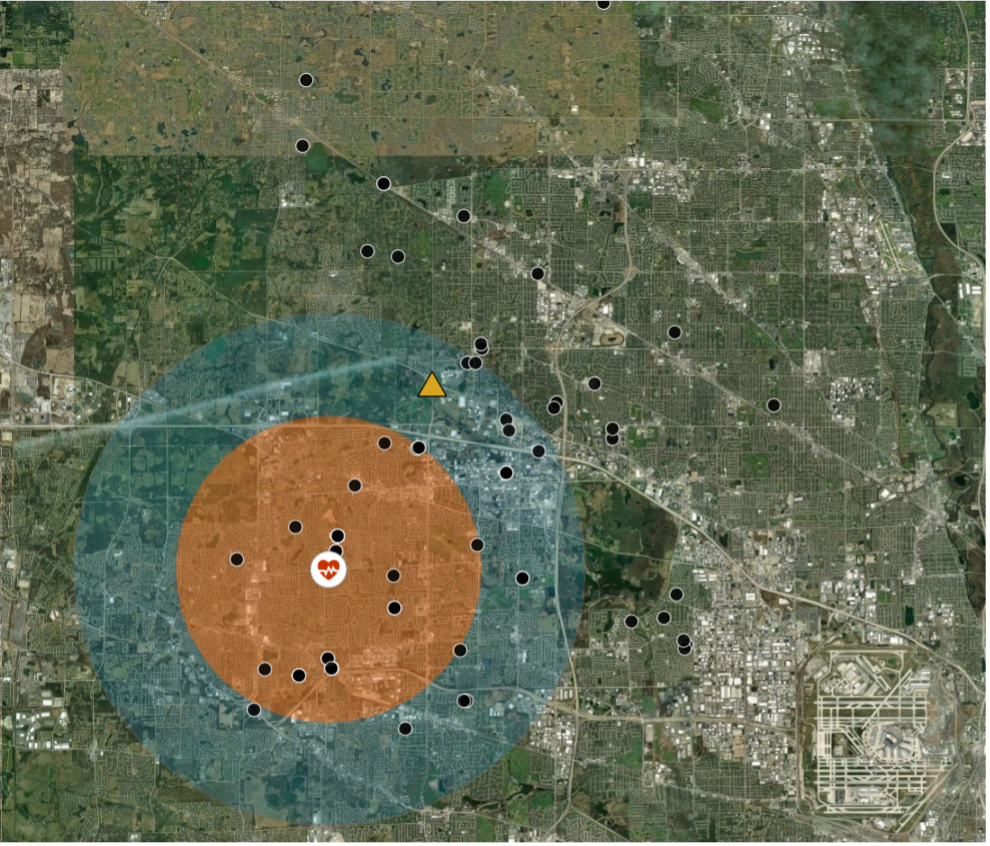
First, notice the dense concentration of clients surrounding the practice itself. This is likely the practice’s core trade area where awareness, convenience, and repeat utilization are the strongest. Yet the practice is also pulling clients from outside the 5-mile and even 10-mile radius. Why is that? A good question, and one that could help determine what is making clients choose this practice when clearly there is a competitor closer to them.
If you don’t have software that can draw a buffer zone around your practice, not to worry. Your general knowledge of the area will suffice, and below you can still see some obvious clusters or clients of interest just by looking at the map visually. It is kind of hard to do from a list of addresses unless you have some photographic memory.
Map 2: Geographic patterns including highway travel corridors, secondary client clusters, and competitor overlap areas.
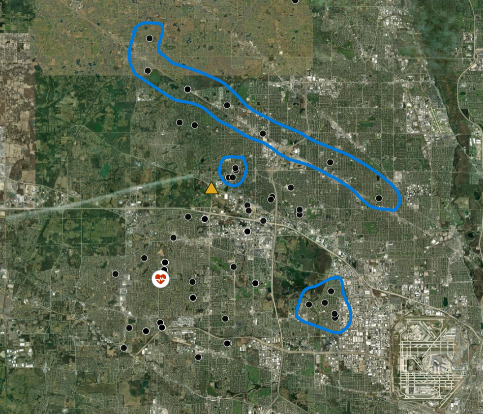
What you will notice between these maps is several interesting geographic patterns. There is a cluster to the east of the practice on the other side of a forest preserve. Interesting. Is it due to a client referral in the neighborhood? Then there is a tiny cluster just northeast of the competitor. Despite another clinic being closer, something is clearly still attracting those clients to this practice, and then there is a string of clients along a highway. Might that be a transportation or accessibility reason, flying down the highway (speed limit of course, precious cargo!), or simply a client’s willingness to travel to see you? What value are you adding, or are they simply loyal to you?
Looking at these maps, you can start to identify your core trade area, areas with potential competitor overlap, and pockets of clients traveling significantly farther for care, all from one visual. That is a 20-30-minute drive versus a 5–10-minute drive within the core trade area.
Knowing this, you can identify strategic growth areas, like strong clusters far from your clinic. Are there more potential clients out there? What neighborhoods are underserved? Are there emerging population growth areas? All of this could support expanded hours, satellite locations, a mobile vet in the north, or targeted outreach and marketing in those specific areas.
You can also identify your competitive risk, like new clinics near your strongest client clusters and/or regions with declining penetration. Map over time!
You might also uncover access-to-care insights. When layering the client location data with pet ownership patterns, income data, population density, veterinary service spending, and visit frequency; you can start to identify potential veterinary deserts, transportation barriers, affordability challenges, and workforce distribution implications.
Mapping can inform decisions like marketing, whether to do a hyperlocal campaign, community partnership, or digital targeting by geography. What about operations? You might identify opportunities related to appointment availability by region, mobile service deployment, or hours aligned with commuting patterns. Then comes strategic planning. Is there a feasible reason to expand, adjust pricing strategy, or shift service mix? Your financial statements will tell you what happened, and geography can often help explain why.
So how do you get started? Well, the good news is that this is increasingly accessible. Some PIMS platforms already offer built-in mapping features. Have you checked yours? It is worth exploring before investing elsewhere. There are also professional platforms like Esri Business Analyst and other GIS tools, along with lower-cost or free options like QGIS, Excel mapping add-ins, and Maply. Even simple ZIP code aggregation approaches can still provide useful insight into the areas you serve. You don’t need anything fancy to get started.
Mapping isn’t just a cool thing to do to see where your clients are, although in my opinion, it is very cool. It is strategic. It helps you understand where your clients are, how geography influences demand, and where your next opportunity may be hiding.
And one final note, I wouldn’t be doing my duty otherwise as a data person who takes personal information seriously without addressing data security. Address-level mapping can sharpen understanding of trade areas, travel behavior, and potential expansion opportunities. That said, practices should be intentional about how these data are managed, both from a security standpoint and in terms of whether aggregated geographic views may provide sufficient insight without unnecessary exposure of detailed client information.
Written by Charlotte McKay